Natura - Digital Magazine
Magazine, Editorial Design, Branding & Visual Identity
2021
Senior Designer

Context
This project focused on adapting the print edition of Natura Argentina magazine into a digital-first format, while preserving its editorial identity and improving readability on screen.
Team & Roles
Case study, analysis and adaptation (Cycle 5):
Designer: Laura Romano
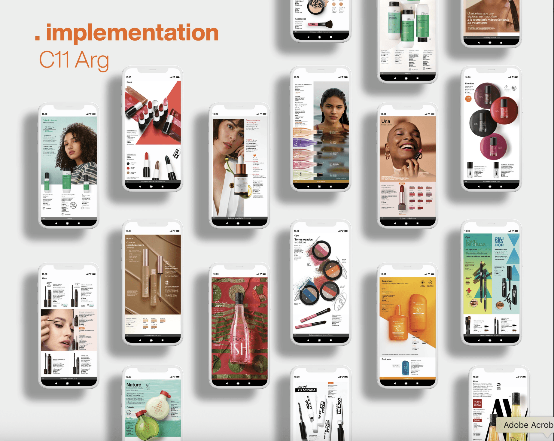
Implementation in Cycle 11:
Designers: Laura Romano / Johanna González
Key Learning Point
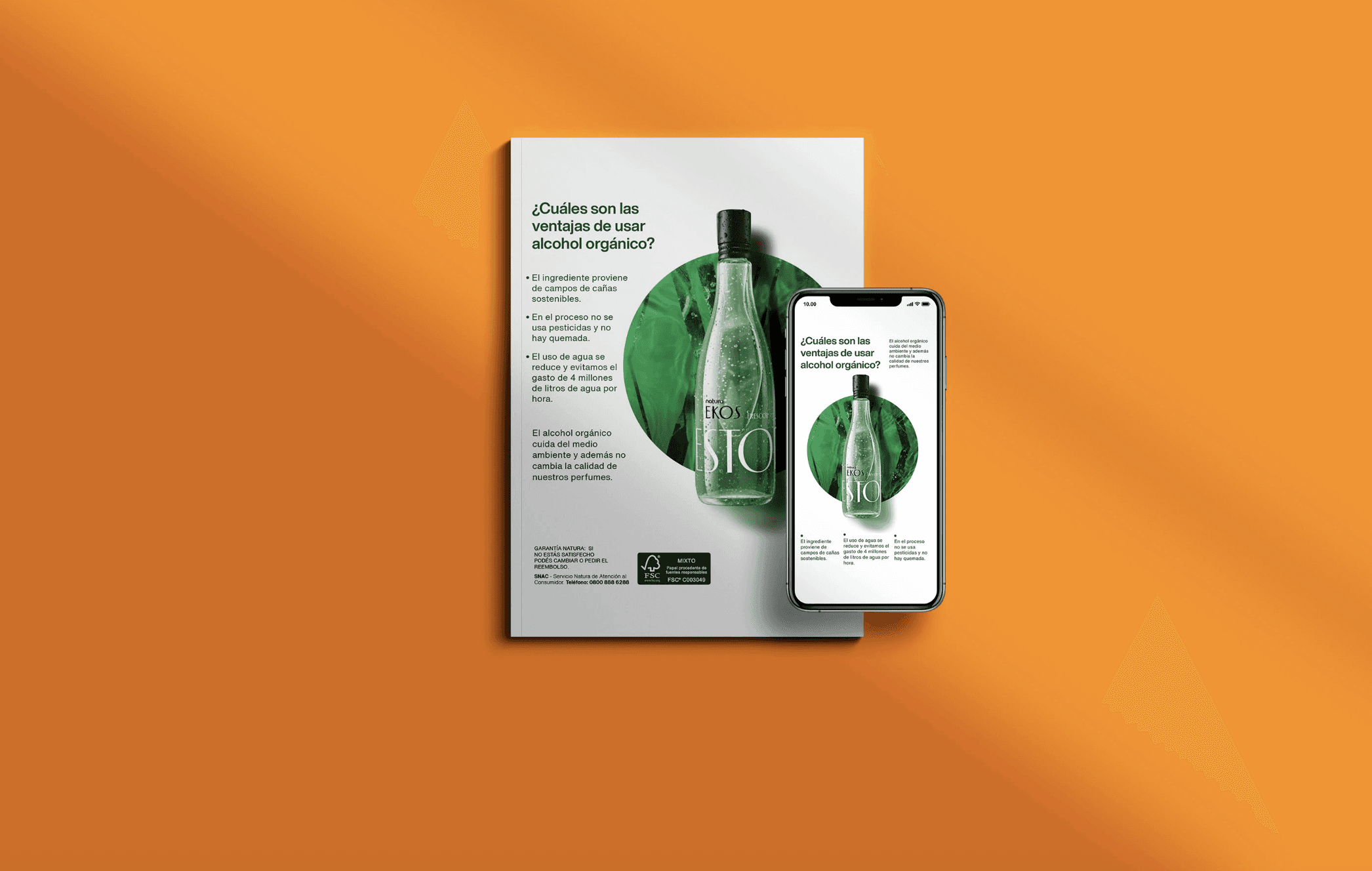
The original magazine (Argentina, Cycle 05) was conceived as a print-first publication, designed in a large double-page format, using CMYK at 300 dpi and structured to be read as spreads.
Although it was not physically printed, it was still produced following print logic: double-page layouts, print-oriented graphic elements, and a visual language optimized for paper rather than for screens. The magazine was reviewed and shared through iView, but its structure remained fundamentally print-based.
This created a mismatch between the format and the actual reading context: a publication designed as print, consumed as digital.
Objective
The main objective was to improve the consumer reading experience by adapting the magazine to a digital-first format. This implied:
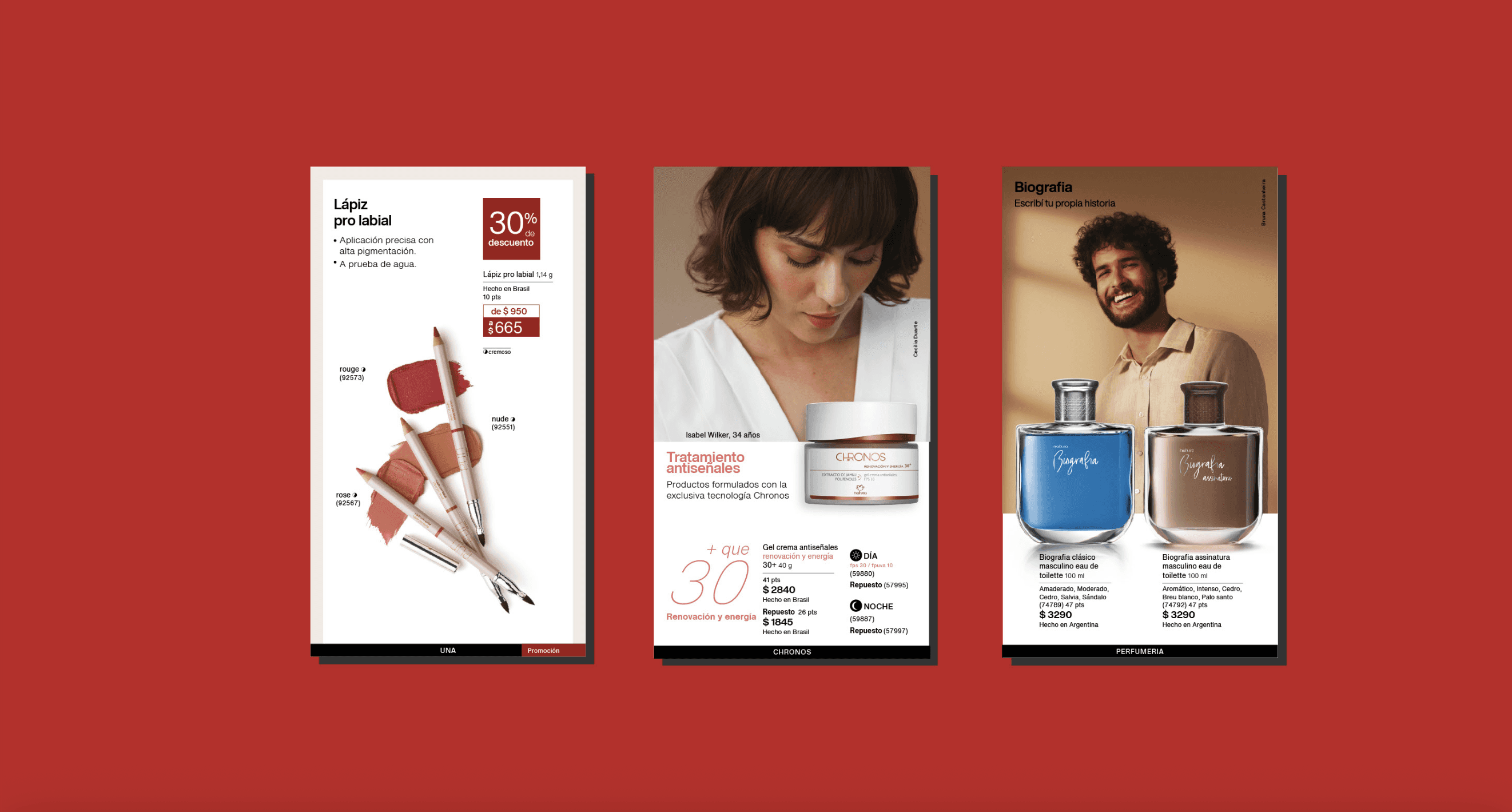
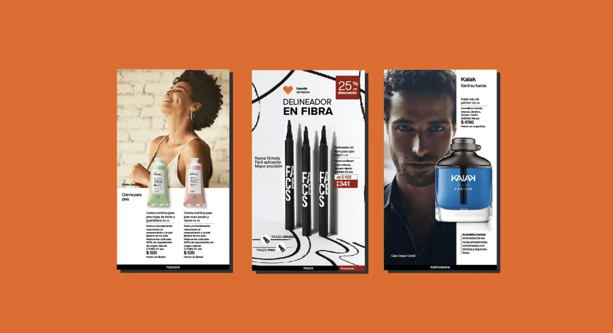
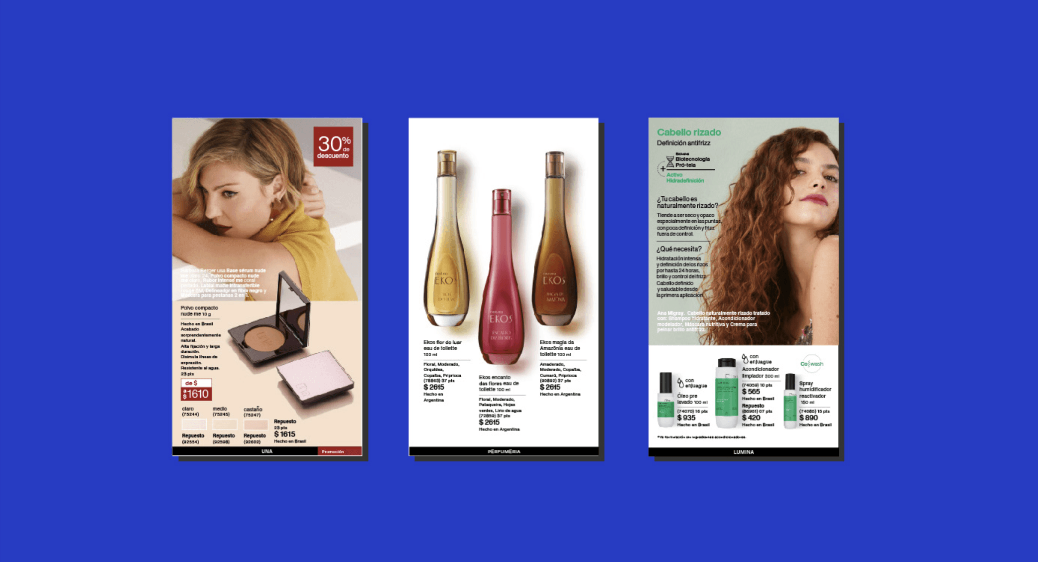
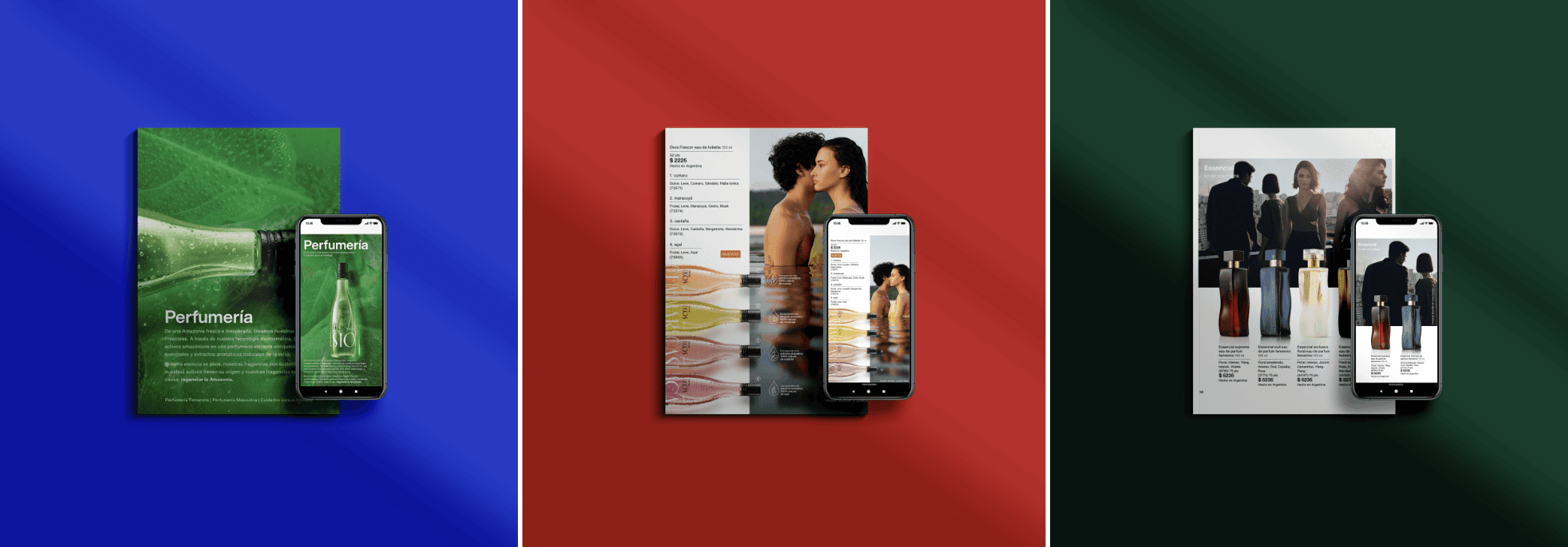
Adapting all content to a single-page vertical format (1080 × 1920 px).
Transforming double-page spreads into pages that could function independently.
Optimizing typographic scales for on-screen readability.
Removing print-specific elements and replacing them with a digital visual language.
Delivering a final version optimized for screen (RGB, 72 dpi).
The goal was not simply to resize content, but to rethink the editorial logic so that it could function naturally in a digital environment.
Solution Definition
The process began with a reduced prototype that included the cover, table of contents, chapter openings and a small set of representative spreads (fragrance, makeup, hair and lifestyle). This initial version allowed us to test hierarchy, type scale and image behavior after changing the format from horizontal double-page spreads to vertical single pages.
Early iterations revealed key issues around typographic scale, inconsistent chapter openings, and the way content behaved when viewed on desktop versus mobile. Through several rounds of testing and internal reviews, we progressively unified typography, adjusted reading hierarchies, simplified layouts, and removed print-specific elements that no longer made sense in a digital context.